Eric Mack Johnson
A modern nonprofit
One Degree Brand
Community research • Focus groups • Brand messaging • Logo design • Identity guide • Marketing materials • Copy

One Degree Brand
Community research • Focus groups • Brand messaging • Logo design • Identity guide • Marketing materials • Copy
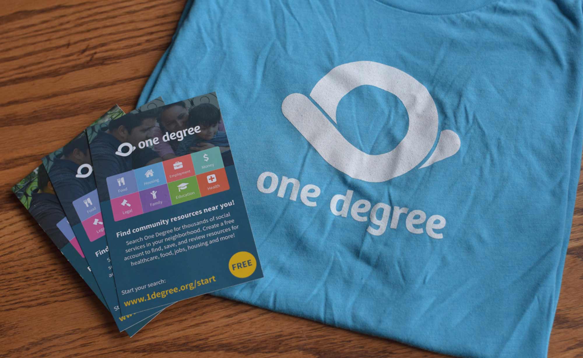
One Degree is a cutting-edge tech nonprofit that's deeply tied to the community they serve. They work with a diverse and multi-lingual population and wanted a visual identity that was inclusive and welcoming. Their original logo was a wordmark in cursive that was hard to read. I led the team through sessions to discover the brand personality and messaging, then designed a holistic identity system that would be both modern and compassionate.
1. Diverse multi-lingual families searching for social services
2. Social workers referring resources to their clients
3. Social service providers listing their resources
4. Funders, government agencies, and other stakeholders
5. One Degree employees, interns, and volunteers

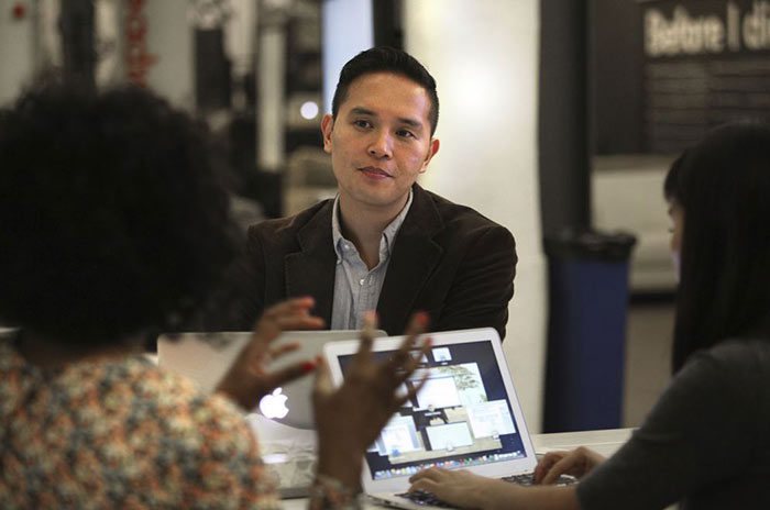
As I was drafting the project plan, I realized that a new brand for an organization this size was going to be different than work I had done in the past. To make sure I had everything covered, I met with two branding professionals to hear about their process. I learned to set up clear goals and measure all of our work against them every step of the way.
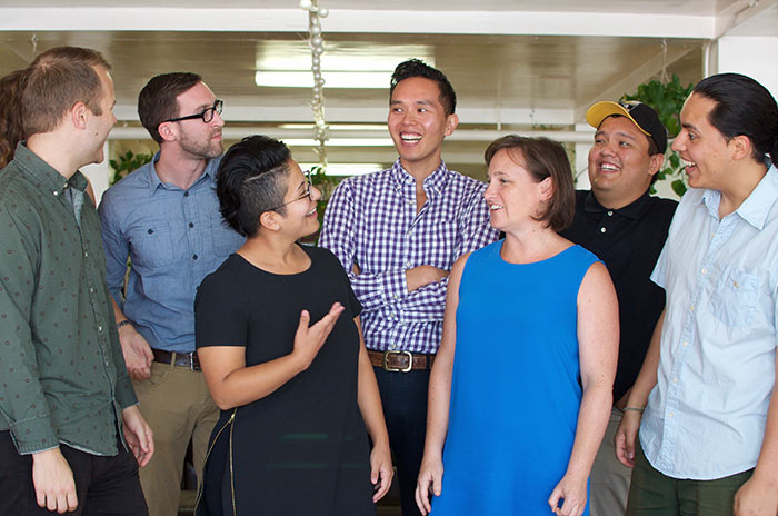
I had our team imagine One Degree as a person and asked them how they would describe them. We decided on a list of personality traits: Hopeful, trustworthy, compassionate, community-oriented, and innovative. We also clarified our organization's mission, vision, and values.
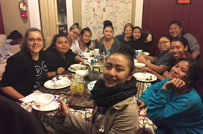
We sat down with our target audience and asked them to describe the emotions involved with searching for social services. We then asked them about their current perception of One Degree. Finally we had them brainstorm examples of people, brands, and activities that matched our target personality traits.
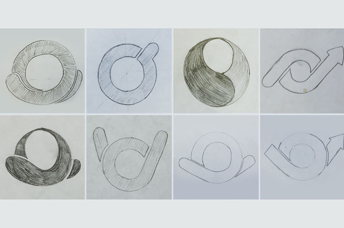
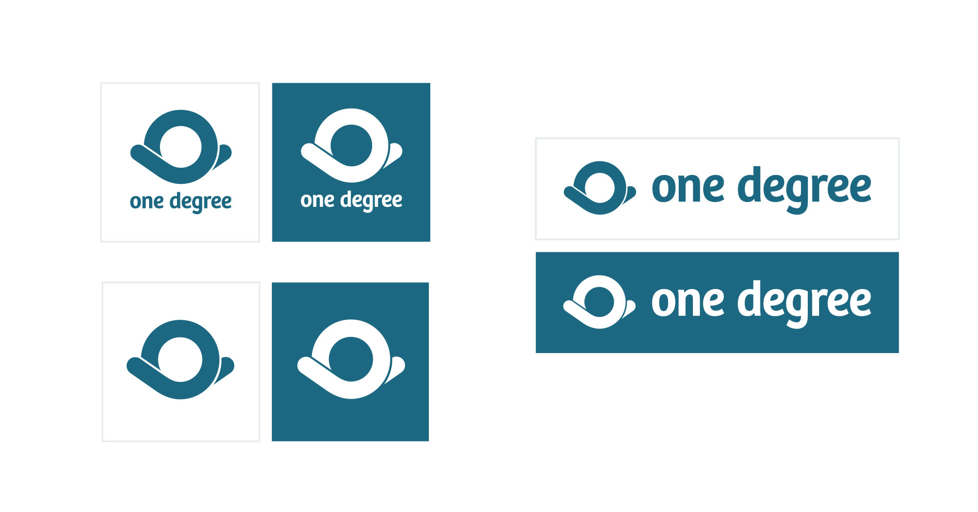
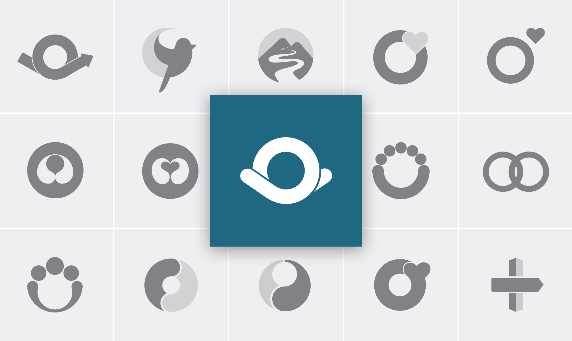
We decided that an icon, rather than a wordmark, would best appeal to our diverse multi-lingual community. I started by reviewing sketches with our team, but realized they needed to be vectorized in our brand colors before people could respond to them accurately. I went through several rounds of presentations, showing the proposed logos in different contexts, until one mark emerged as a clear favorite.
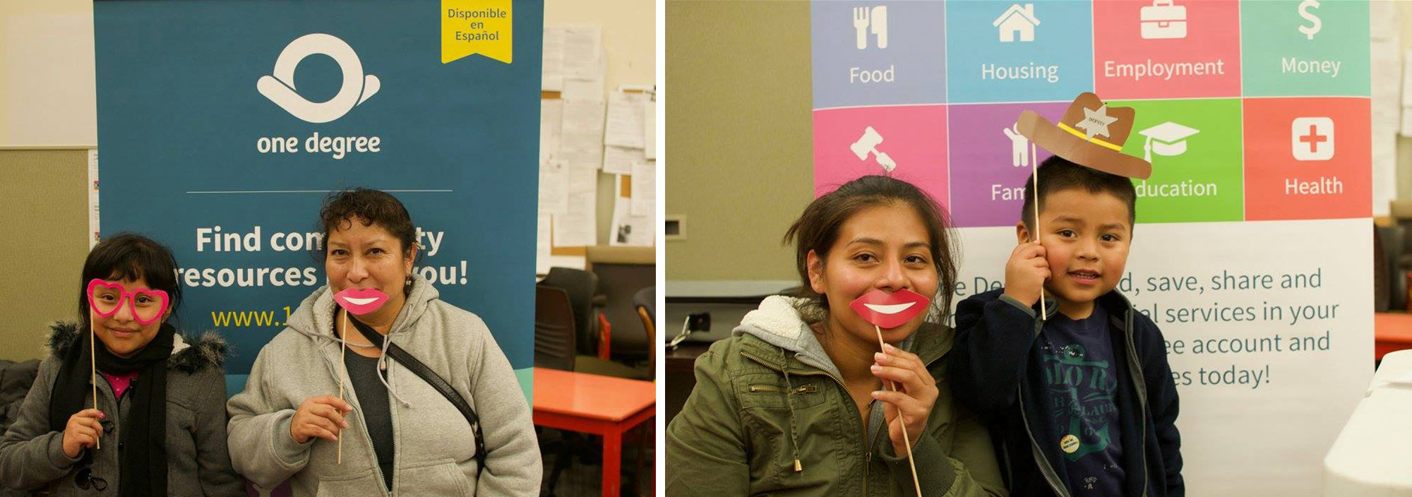
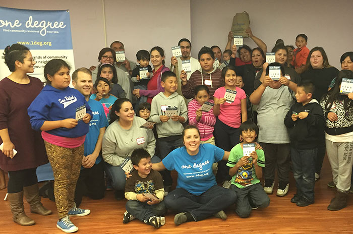
Participants were given the logo and a list of personality traits, 10 that were on-brand like "hopeful" and 10 that were off-brand like "formal." 76% of their responses were on-brand and when using their own words to describe the logo, they said it looks like "caring, the circle of love" and "gathering things togethers and giving them out" and "a hug."
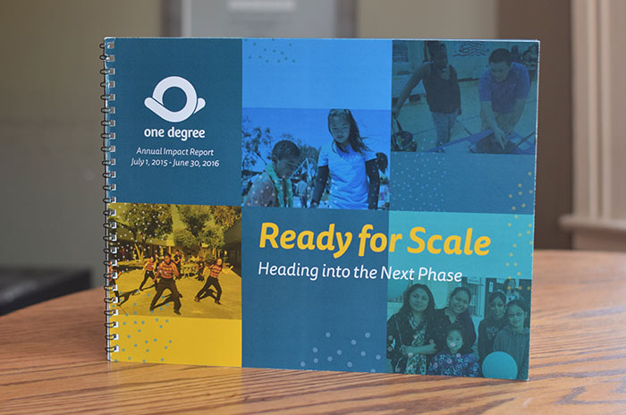
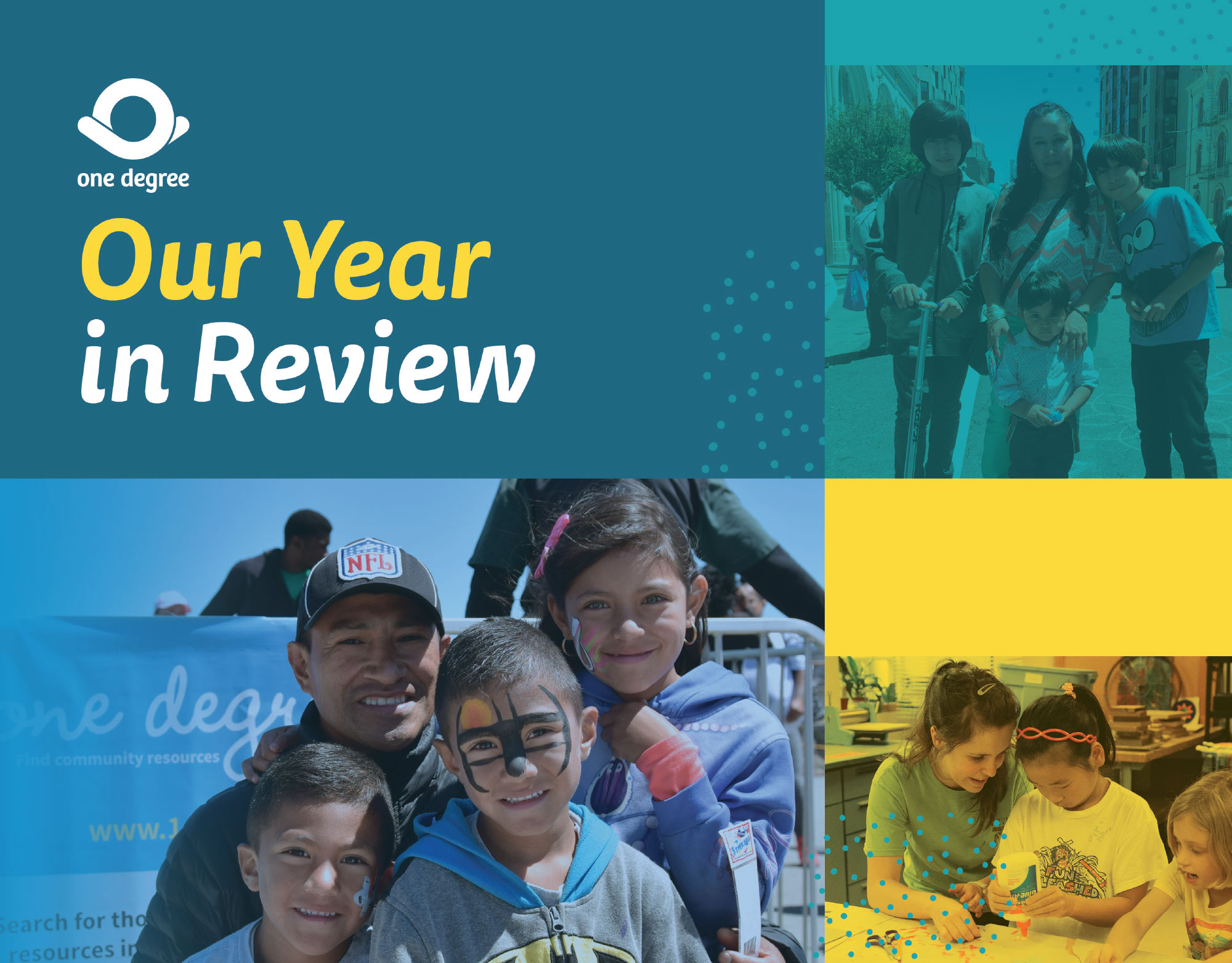
We used the guide to create new marketing materials, web designs, funder infographics, and our Annual Impact Report. All these different mediums now had a consistent look and message.
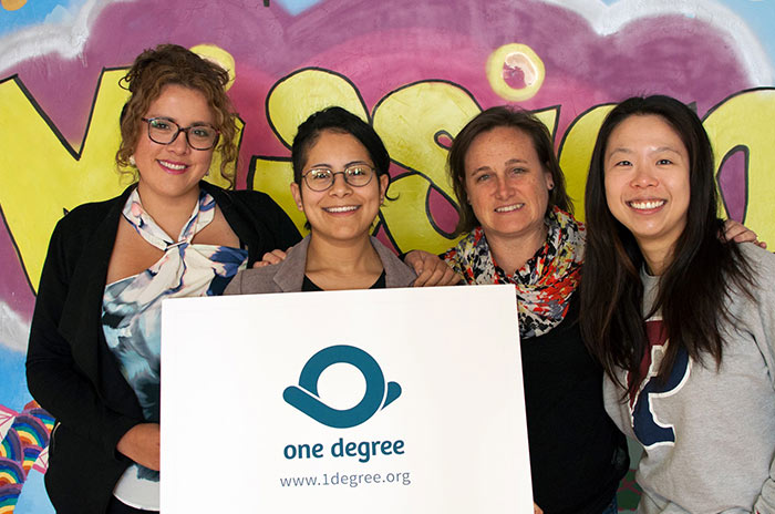
We decided to retain our old brand while completing our expansion across the Bay Area. As we launched our new website and moved into a new region, we had the perfect opportunity to announce the new brand. The change was communicated by email, blog post, a banner on the homepage, and introduced at a launch party at our office.
