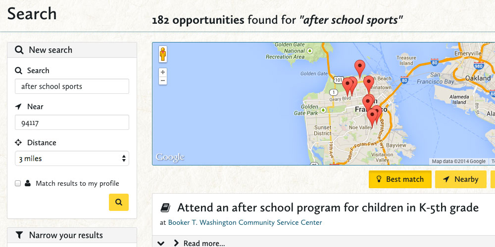
Before
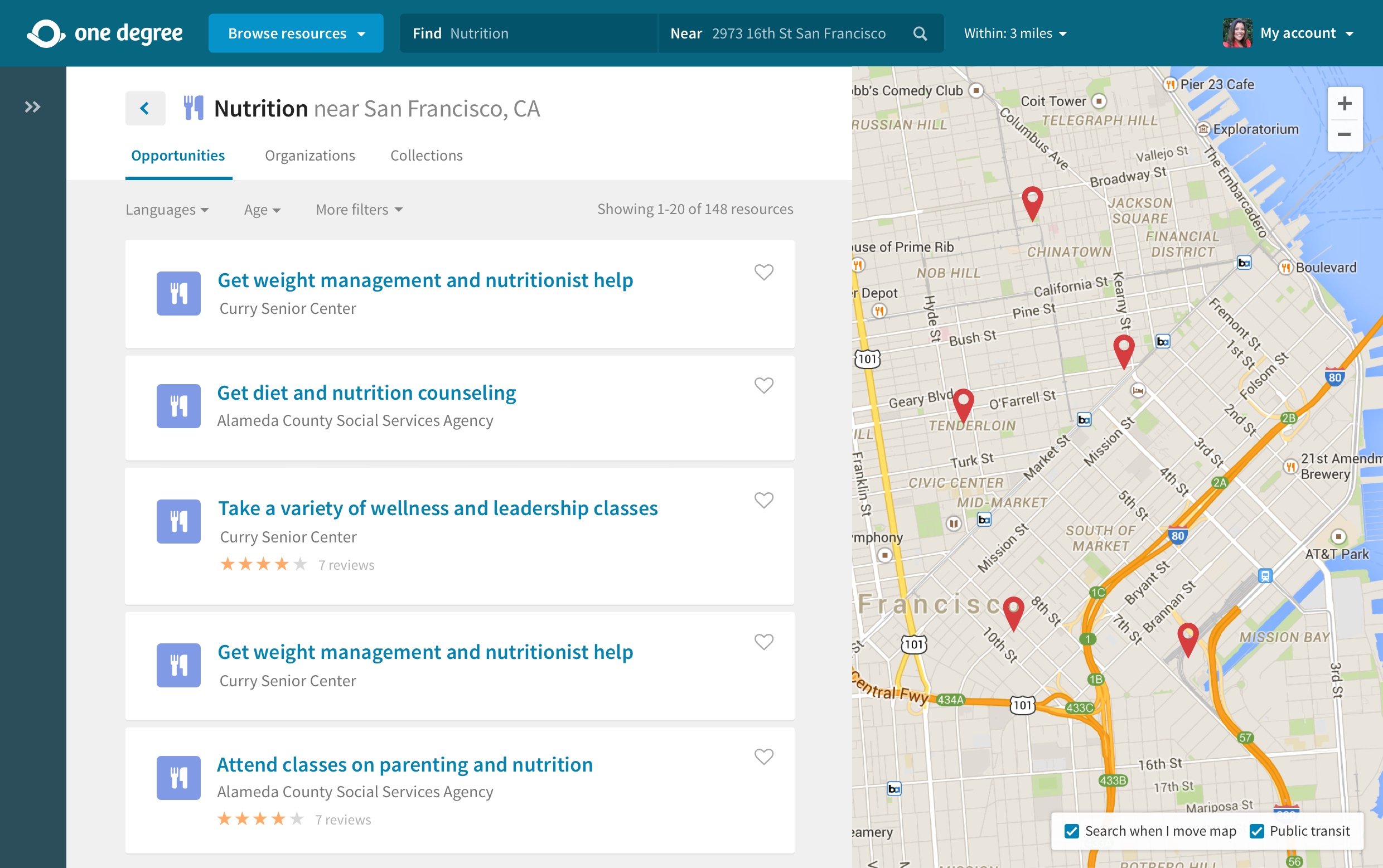
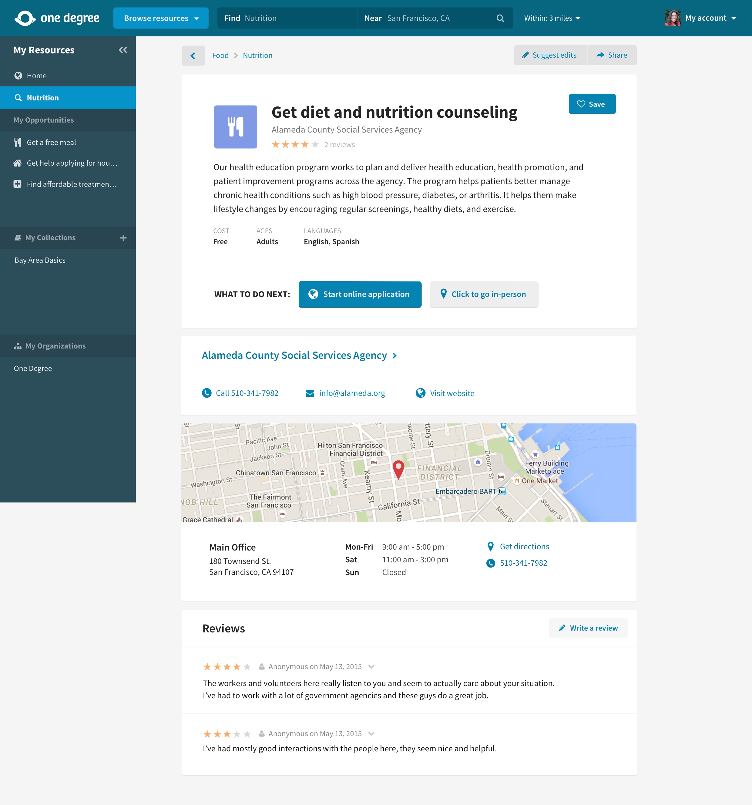
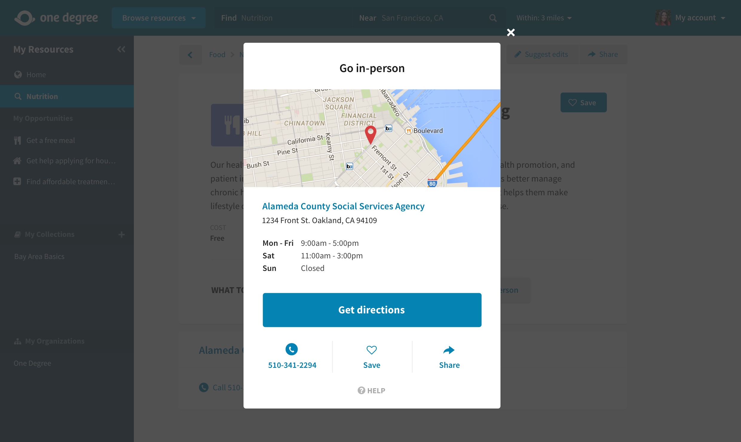
After
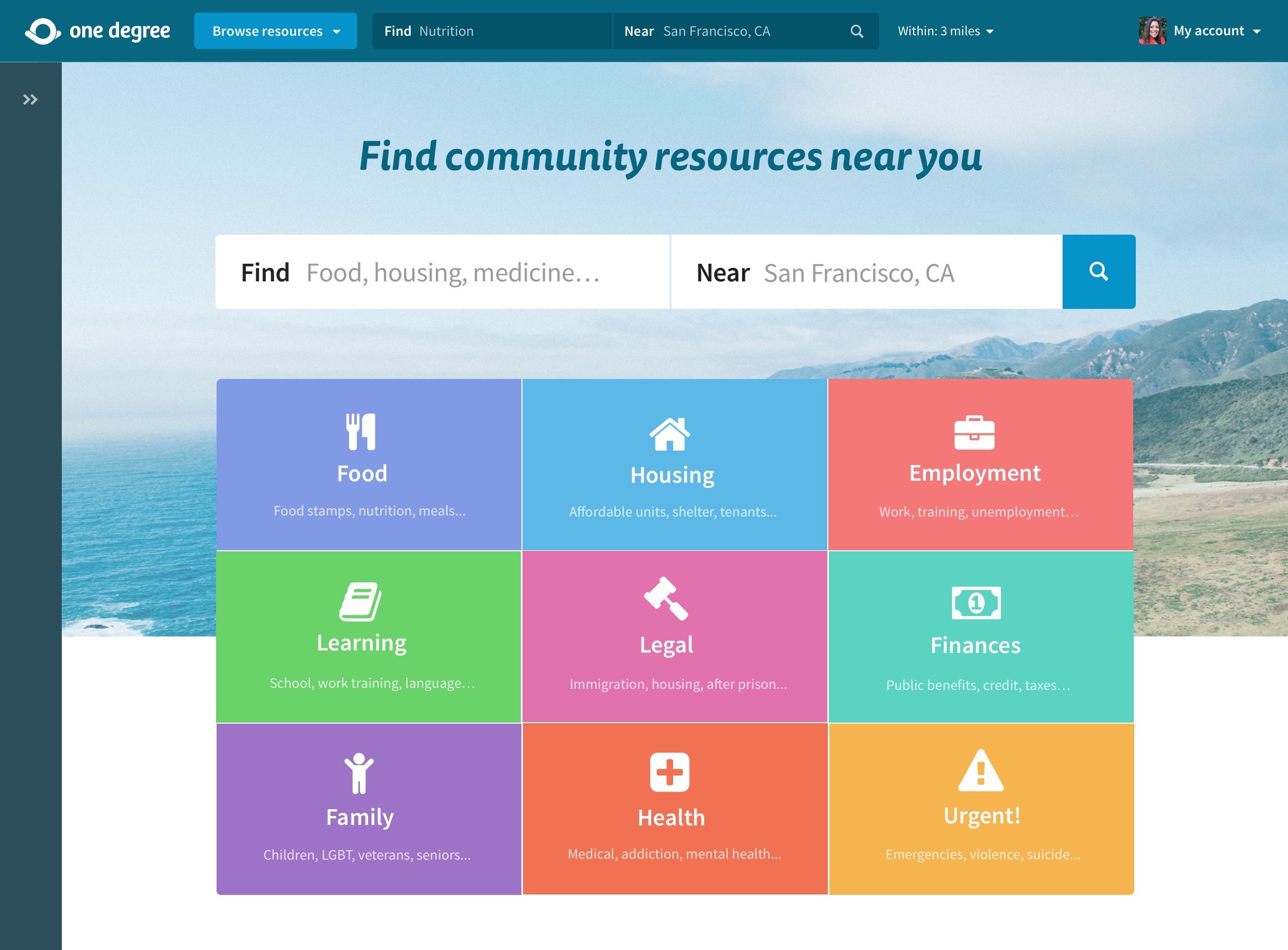
One Degree Web App
User research • Wireframes • Mockups • Prototypes • Usability studies • Front-end development • A/B testing • Analytics
One Degree's mission is to connect people with the resources they need to overcome poverty. When I joined, they had already made incredible progress with just the two co-founders. My job was to make their social service data accessible by anyone, anywhere – from a smartphone to a library computer.
1. Families searching for social services
2. Social workers referring resources to their clients and tracking their status
3. Service providers listing their resources and tracking client status


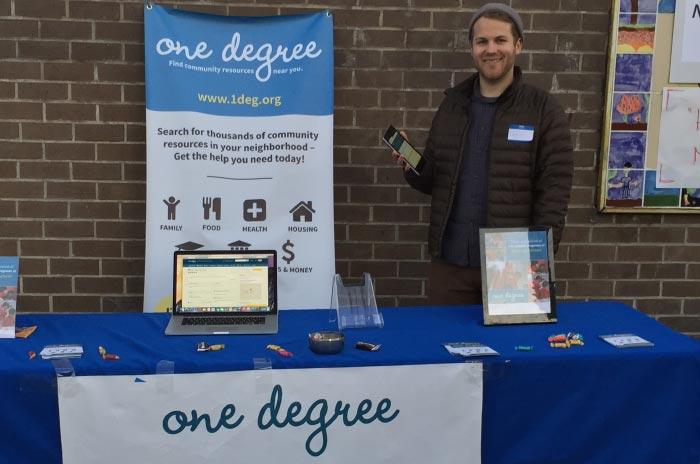
I used the live site to conduct usability studies with 5 community members and used the results to make a priotized plan for improving the user experience. We immediately made a few changes to the existing site, then started preparing for a design overhaul.
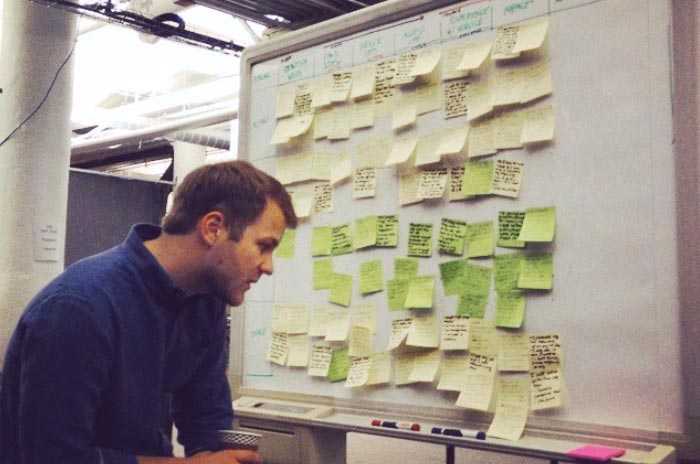
To better understand all the ways One Degree interacted with different audiences, I created a user experience map of how users were introduced to the organization, solved a problem or got value from the interaction, and then repeated this for a long-term relationship. This led to a key new metric: The Indicator of Access, or proof that a member had accessed services.
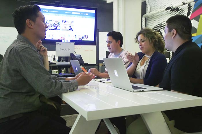
With the results of the usability study and a new understanding of our user funnel and goals, I drew wireframes, built mockups in Sketch, and walked our team through the different experiences. After a few rounds of refinement, the engineers began coding the back-end while I prepared to get external feedback.
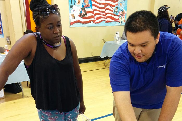
I used InVision to create clickable prototypes of the mockups, both mobile and desktop, and drafted questions for a usability study. I met with 5 community members and 5 nonprofit professionals and asked them to complete different tasks on the prototype. I noted where they were successful and where they encountered difficulties.
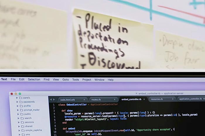
After making improvements from the usability studies, I created internal prototypes to communicate different user flows to the engineering team. I also made a CSS guide that would help us create a consistent front-end style. When they had made a first pass, I helped refine the CSS and tested the key user flowers on different browser versions and devices.
We used social media, email campaigns, and blog posts to announce our new site and gathered to celebrate. Nonprofit professionals from Contra Costa shared how helpful the site would be for their remote clients.
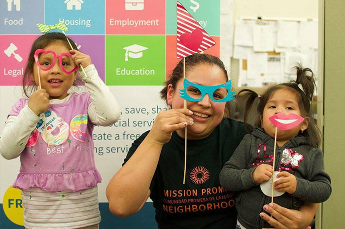
In the year we launched the new site, One Degree's membership doubled from 3,356 to 6,602 members. 91,906 unique people used the site, a 139% increase from the previous year. We continued to add and refine features, like a new referral tool for case managers.
